Introduction.
Welcome to a milestone moment in our journey – a decade in the making, yet it feels just like yesterday when I was sat in the sunlit corner of a cafe, scribbling name ideas for a new design agency as if it were my first born child.
Fast forward 10 years, and here we are with an amazing team of 15 super talented individuals who consistently produce amazing work for our ever-expanding client base.
In 2023 we decided to celebrate this milestone with an updated website (coming very soon) and also something standalone, where we could share our history and who we are today.
Collaboration
As we wanted the project to be a collaborative effort, we got the design team together (Matt, Margo, Nicola and myself) to start brainstorming ideas.
The requirements were :
- Standalone microsite
- Includes our history
- Shows where we are now
- Highly interactive
- Uses cutting-edge web tech
- Big and bold design

Nicola, our talented Digital Designer, had the first light bulb moment – “We’ve gotta call it the KOTAverse right?!”
BINGO! …The KOTAverse was officially born. Now onto the design.

Designing the timeline
Visualising what the KOTAverse could look like was our next challenge. We embraced the spacey, futuristic vibe that the name brings to mind, and in our research phase, stumbled upon a couple of incredibly cool things.
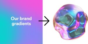
Firstly the Blob Mixer, an interactive WebGL componant. As we’ve already got a soft spot for blended gradients as part of the KOTA brand, we thought this would be perfect as the blob’s material. It looks futuristic ✅, uses cutting-edge technology ✅, and is interactive ✅!

The second cool thing we found was the portfolio of Cyd Stumpel, an extremely talented creative Web Developer based in the Netherlands (more about Cyd later).
We loved how she presents her work on the homepage using a rotating 3D carousel and it got us thinking of how to present our history.
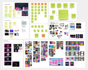
So with this and the blob in mind, we started to experiment using After Effects. The concept is centered around an interactive journey through history; as users scroll, they’ll see a dynamic visual timeline, with events orbiting around a central blob. Each event can be clicked on, inviting users to delve deeper and explore more about each significant moment.
Early demo
Once we were all happy with this concept, we gave the design a bit of polish.
Going deeper
For the ‘Who We Are Now’ section, we quickly knew that it would be contained within the KOTAverse orb (our signature blob). Here, users are enticed with the option to click into the orb to ‘Go Deeper,’ a feature that transports them inside, offering an immersive, in-depth exploration of our current identity and ethos.
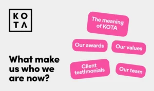
We then came up with 5 content types we feel make us who we are now, we’re most proud of and were interesting to share.

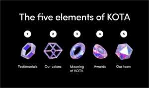
The fifth Element
After we decided on the content, Margo (another very talented member of the design team) blew all our minds. Her idea was that the five content types were actually ‘elements’ with the Fifth element – Our team, being the most important.
To tie things in with the orb, each element would be represented by a 3D shape using our brand colours.

Now that we had the five elements confirmed, we started to think about how this area of the site would function. We really liked the concept of an innerspace, inside the KOTAverse, where you could drag around exploring these elements infinity (until you got bored of course).
Nicola had a fun idea that the team were on Top Trump cards, so we decided to use this format for all the other elements.

We also used AI and Neuralframes to create some pretty cool avatars of ourselves.